Thinkdeli is used for long-form writing, journaling, publishing essays, drafting ideas, and maintaining consistent writing habits. The product prioritizes clarity, simplicity, and flow, making it easier for users to get into a writing rhythm and stay there.
01 ABOUT
Role
Brand Design
Illustration
As the Brand Designer + Illustrator, I shaped the visual direction of Thinkdeli’s web presence. My responsibilities included:
Defining the color palette
Proposing and evolving the illustration style
Creating the hero/landing page illustration
Designing the footer artwork
Building a cohesive icon set that brings personality into the UI
I ensured the brand felt playful, inviting, and creative —reflecting the experience of writing and ideation.
TIMELINE
2025
Brief
The brief was to develop a brand identity that captures the joy of writing without feeling too corporate or boring. The website needed to feel:
Creative
Friendly
Light and expressive
Still polished enough for professionals who use the tool
The challenge was finding a style that balances creativity and credibility.to scale across product, marketing, content, merch, and events
02 BRANDING
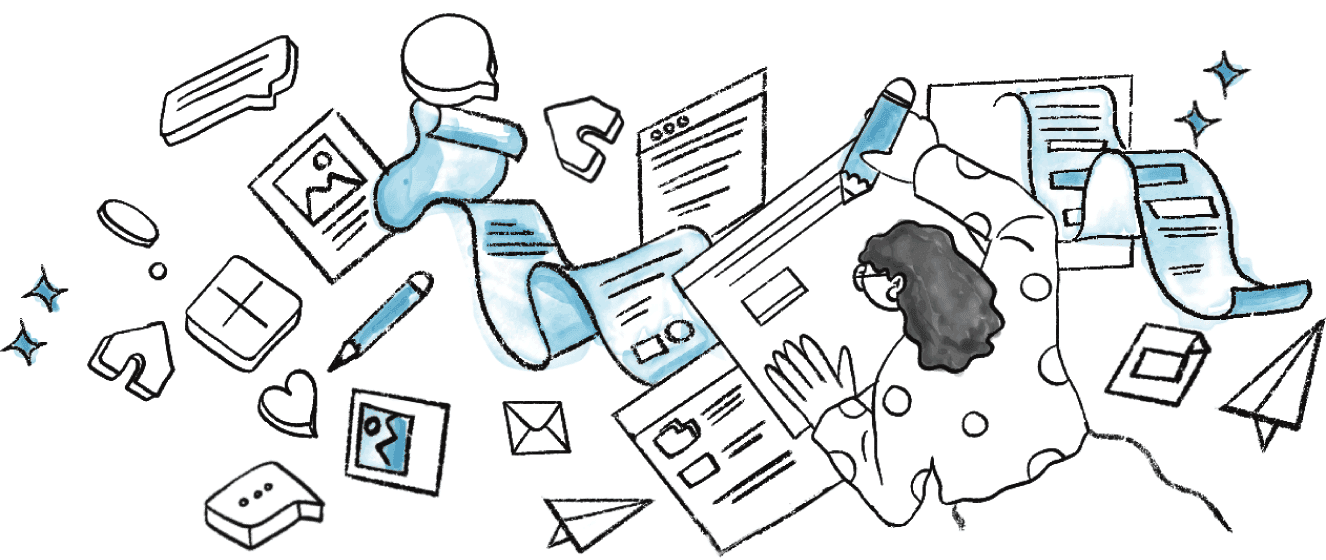
First draft
The initial direction explored a blue watercolor palette paired with soft, minimal illustrations.
The blue tones gave a calm, clean, almost enterprise-like feel.
The watercolor texture added lightness and subtle creativity.
Visually, this direction felt polished but slightly too serious for a writing tool meant to feel warm and expressive.
While it communicated clarity, it lacked the vibrancy and playfulness that matches the act of creative writing.






Final pick
The direction evolved into a multi-color crayon-inspired system—a balance of structure + creativity.
We kept blue as a grounding tone but expanded the palette with warm, playful colors.
Crayon textures brought in spontaneity, personality, and a sense of “thinking on paper.”
The style felt more human and expressive, aligning better with Thinkdeli’s goal of making writing enjoyable again.
This hybrid look—clean structure with hand-drawn energy—became the core of Thinkdeli’s visual identity.


Icons
I designed a custom icon set that follows the same expressive style:
Simple shapes with crayon textures
A mix of soft colors
Friendly visual cues that lighten the interface
Icons that feel hand-crafted rather than generic
These icons help the product feel more alive and relatable, enhancing both usability and brand personality.

Mind Maps

Voice Transcription

Deep Insights

Grow your audience

Writing Assistant

Share posts as images

Work offline

Organize

Writing Streak

Writing Streak

Deep Insights

Writing Streak