Clarisights

Clarisights is the leading marketing analytics platform for Enterprises. It helps marketers connect, visualize and explore all the marketing data in one place. Trusted by Uber, Delivery Hero, HelloFresh and About You.

01 ABOUT

Role

UI Design

Brand Design

Framer Development

I owned the end-to-end brand revamp from visual direction and UI design to illustrations, ads, and marketing collaterals.

I handled the full design execution in Figma and Framer, collaborated with marketing teams and agencies, and maintained consistency across all brand channels.

TIMELINE

TIMELINE

Jun 2025 - Present

Brief

The existing website felt old-fashioned and didn’t reflect the scale of the customers. It needed to look more enterprise-ready, credible, and approachable for marketers while still being comfortable for data teams. My task was to refresh the visual language, modernize the interface, and fix UX issues across core pages.

02 OLD VERSION

Discovery

Before designing anything, I looked at what was working and what wasn’t:

  • The colours were harsh and outdated.

  • Imagery felt generic and didn’t reflect our product.

  • Sections lacked hierarchy and looked visually heavy.

  • The brand didn’t communicate trust or scale expected by enterprise clients.

  • The palette limited illustration styles, making visuals inconsistent.

  • Some user flows (like Book a Demo) were confusing and had drop-offs.

03 Re BRANDING

colors

The new palette uses:

  • Soft greens for approachability

  • Light backgrounds for easier reading and a calmer feel

  • A dark green to anchor important content and separate sections

  • Soft gradients in illustrations for a modern look without being flashy

TYPOGRAPHY

The existing fonts worked well across both product and marketing, so keeping them ensured consistency and reduced friction between teams.

Primitive colors (WIP)

Description

Primary Brand Green

For Info Theme color

50

E6F3F1

100

CEE7E4

200

B5DAD6

300

9DCEC9

400

84C2BB

500

6CB6AD

600

53A9A0

700

3B9D92

800

229185

900

#0A8577

Text

For Info Theme color

50

#F4F4F5

100

#E4E4E7

200

#E4E4E7

300

#D4D4D8

400

#A1A1AA

500

#71717A

600

#52525B

700

#3F3F46

800

#27272A

900

#18181B

Brand (Indigo)

For Brand Theme color

50

#F7F7F7

Usage: Nil

100

#F7F7F7

Usage: Nil

200

#F7F7F7

Usage: Nil

300

#F7F7F7

Usage: Nil

400

#F7F7F7

Usage: Nil

500

#F7F7F7

Usage: Nil

600

#F7F7F7

Usage: Nil

700

#F7F7F7

Usage: Nil

800

#F7F7F7

Usage: Nil

900

#F7F7F7

Usage: Nil

Green

For Success Theme color

50

#F7F7F7

Usage: Nil

100

#F7F7F7

Usage: Nil

200

#F7F7F7

Usage: Nil

300

#F7F7F7

Usage: Nil

400

#F7F7F7

Usage: Nil

500

#F7F7F7

Usage: Nil

600

#F7F7F7

Usage: Nil

700

#F7F7F7

Usage: Nil

800

#F7F7F7

Usage: Nil

900

#F7F7F7

Usage: Nil

Amber

For Warning Theme color

50

#F7F7F7

Usage: Nil

100

#F7F7F7

Usage: Nil

200

#F7F7F7

Usage: Nil

300

#F7F7F7

Usage: Nil

400

#F7F7F7

Usage: Nil

500

#F7F7F7

Usage: Nil

600

#F7F7F7

Usage: Nil

700

#F7F7F7

Usage: Nil

800

#F7F7F7

Usage: Nil

900

#F7F7F7

Usage: Nil

Red

For Error Theme color

50

#F7F7F7

Usage: Nil

100

#F7F7F7

Usage: Nil

200

#F7F7F7

Usage: Nil

300

#F7F7F7

Usage: Nil

400

#F7F7F7

Usage: Nil

500

#F7F7F7

Usage: Nil

600

#F7F7F7

Usage: Nil

700

#F7F7F7

Usage: Nil

800

#F7F7F7

Usage: Nil

900

#F7F7F7

Usage: Nil

Blue

For Info Theme color

50

#F7F7F7

Usage: Nil

100

#F7F7F7

Usage: Nil

200

#F7F7F7

Usage: Nil

300

#F7F7F7

Usage: Nil

400

#F7F7F7

Usage: Nil

500

#F7F7F7

Usage: Nil

600

#F7F7F7

Usage: Nil

700

#F7F7F7

Usage: Nil

800

#F7F7F7

Usage: Nil

900

#F7F7F7

Usage: Nil

CTA

Primary + Secondary CTAs - WIP

Get a Demo

Primary CTA

#266B31

Get a Demo

Hover

See all Integrations →

Secondary CTA

Outline #266B31

See all Integrations

Hover

On Dark Background

See all Integrations

Primary

See all Integrations

Hover

Acid Grotesk

by FOLCH

ABCDEFGHIJKLMNOPQRSTUVWXYZ

ABCDEFGHIJKLMNOPQRSTUVWXYZ

0123456789

paired with Inter

by Rasmus A

ABCDEFGHIJKLMNOPQRSTUVWXYZ

ABCDEFGHIJKLMNOPQRSTUVWXYZ

0123456789

Heading 1

Bold, 64/110%, -0.1px letter spacing, slate 100

Heading 2

Medium, 48/52.8 (110%), -1.1px letter spacing, slate 100

Heading 3

Extra Bold, 36/39.6 (110%), -1.1px letter spacing, slate 100

Heading 4

Extra Bold, 28/30.8 (110%), -0.1px letter spacing, slate 100

HEADING 5

IBM PLEX MONO, 14/15.4 (110%), 0.0px letter spacing, Blue 500

Default body copy ipsum dolor sit amet, consectetur adipiscing elit. Morbi a lacinia augue.

Inter, regular, 16/20 (150%), slate 100

Small body copy ipsum dolor sit amet, consectetur adipiscing elit. Morbi a lacinia augue.

Inter, 14/22 (157.1%), line spacing 0px, slate 100

EYEBROW

IBM Plex Mono, 14|22 Line-spacing: 130%, +0.9 tracking

ICONS

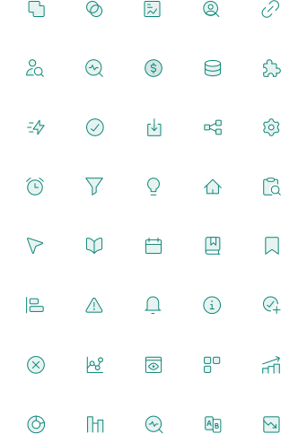
I updated the icon style to be simpler, lighter, and more aligned with the new palette. The icons now feel cleaner and match the modernised illustration direction without overpowering the interface.

Illustrations

I shifted to softer, cleaner illustrations with structured gradients and minimal detail. This made technical concepts easier to understand while giving the brand a unified, polished look.

04 USER INTERFACE

HOMEPAGE

I reorganized the site to make the value clearer for marketers while reassuring data teams about accuracy and scale.


The new layout is cleaner, more spaced out, and highlights the product story simply.

Pages now guide you through the value prop instead of overwhelming the user with information.

Integration

The pricing page is structured around three clear plans, with a custom tier supported by a price slider to make it feel flexible and transparent.

book a demo

BOOK A DEMO

The old flow was confusing as users had to schedule a meeting before filling a form.

I tried to simplify it:

  • Form first for qualification

  • Then HubSpot scheduling

  • Added testimonials and G2 ratings to build trust and reduce drop-off

The result is a smoother, more logical conversion flow.

The old flow was confusing as users had to schedule a meeting before filling a form.


I tried to simplify it:

  • Form first for qualification

  • Then HubSpot scheduling

  • Added testimonials and G2 ratings to build trust and reduce drop-off


The result is a smoother, more logical conversion flow.

05 FRamer DEVELOPMENT

Built for scale

Built for scale

I built the entire site in Framer using components, variables, and a CMS-first approach so the marketing team could update content without designers or developers.

Key work included:

  • Setting up global colour styles, text styles, grids, and spacing tokens for consistency

  • Creating reusable components for cards, sections, buttons, forms, nav and footers

  • Designing a scalable CMS structure for blogs, guides, case studies, integrations, testimonials, and product pages

  • Handling asset creation and optimisation (SVGs, illustrations, previews)

  • Setting rules for layout, padding, animations, and interactions

  • Ensuring performance by limiting heavy assets and using lightweight animations

  • Making the site modular so new pages can be built using existing components in minutes

This setup helps the team ship updates fast and keeps the website visually consistent, even when different people are editing it.

I built the entire site in Framer using components, variables, and a CMS-first approach so the marketing team could update content without designers or developers.

Key work included:

  • Setting up global colour styles, text styles, grids, and spacing tokens for consistency

  • Creating reusable components for cards, sections, buttons, forms, nav and footers

  • Designing a scalable CMS structure for blogs, guides, case studies, integrations, testimonials, and product pages

  • Handling asset creation and optimisation (SVGs, illustrations, previews)

  • Setting rules for layout, padding, animations, and interactions

  • Ensuring performance by limiting heavy assets and using lightweight animations

  • Making the site modular so new pages can be built using existing components in minutes

This setup helps the team ship updates fast and keeps the website visually consistent, even when different people are editing it.

06 ADs

  • Worked with a marketing agency to design performance ads for Google, Meta, LinkedIn

  • Analysed historical ad data to understand which colours and compositions converted better

  • Designed multiple formats (Statics, Carousels, Doc Ads) optimised for clarity and retention

  • Dark-green ads consistently delivered higher CTR because they stood out in feeds and aligned well with the new brand

  • Created a flexible ad system where templates could be reused for new campaigns without redesigning from scratch

High

Can you just pull

this number for me?

That’s how your day slips away.

High

You start with one request

High

High

and suddenly you’re stuck in it for hours.

then....another

Every “quick” request pulls you further from your core task.

But there’s a way out


Clarisights lets marketers

dig into their own data within predetermined criteria.. 


They explore, build, and check performance without knocking on your door.


High

High

Sounds good?


High

High

Know how we can help you.

(Link in the caption)


Delivery Hero taps Clarisights to empower 300+ marketers with real-time insights

No SQL, zero waiting!

Challenge

Marketers waited weeks for data and relied on spreadsheets or ad platforms only. 

BI maintenance stole the data team’s time, delaying strategic initiatives.

Marketers lacked timely data access. 


Solution

300+ marketers could generate their own dashboards without external dependencies. 

MMP, MTA, and other attribution data is automatically joined


Enabled data team to focus on strategic work like bringing MMM in-house.

Clarisights gave Delivery Hero a centralized self-service insights platform. 


Instant visibility and data-driven agility across brands. 

Fast access to insights across regions and campaigns. 

Marketers moved from CAC focus to ROAS and profit margin contribution. 

Impact

Data team productivity skyrocketed— shifted from maintenance to innovation.

Want to see how

Delivery Hero turned

300+ marketers into

data experts

Check out the full case study via the link in the caption.

!

!

Still manually pulling

reports from

12 different platforms?

Does your calendar look like this?

9 AM

12 AM

6 PM

Gather data from

...

Build dashboards your manager will question.

PANIC when numbers don't match...

The Real Cost of Manual Reporting

20h

wasted weekly

47%

data errors

0

strategic time

What if you could automate ALL of this?

Bitpanda's marketing team went from

Here's exactly how they did it...

Real-time automated insights

40 + hours

of manual work

Get the Complete Playbook

See how Bitpanda transformed its marketing operations with Clarisights

07 LEARNINGS

  • Maintaining visual consistency between product and marketing avoids confusion and builds trust

  • CMS-first websites reduce long-term dependency on designers and developers

  • Keeping user flows simple (e.g., the Demo form) directly improves conversions

  • Large integration libraries (300+) require a structured backend approach; manual management becomes impossible

  • Collaboration with agencies is smoother when visual systems and component rules are already documented

  • Always design for scale — websites grow, and the structure should support that from day one

Have a nice day :)

© 2026 All Rights reserved

Have a nice day :)

© 2026 All Rights reserved

Have a nice day :)

© 2026 All Rights reserved