Last9
Unified Observability Platform Transforming how engineering teams monitor systems at scale.
01 ABOUT
Role
UI Design
Brand Design
Illustration
Marketing
When I joined Last9, the brand leaned heavily enterprise serious, safe, and visually distant from the engineers it was built for. Over the next year and a half, I worked on shaping this identity to make observability feel more approachable and relatable to SREs. This case study documents the original Last9 brand system and the thinking behind it, before the brand later evolved into a darker, more developer-forward direction (Check Last9 v2 case study)
TIMELINE
Sep 2023 - Feb 2025
Brief
The goal was to build a brand that helps explain the complexity of observability while still resonating with the people who actually use it (SREs and engineers). Observability is hard, layered, and technical, so the challenge was to communicate that complexity without overwhelming users.
The brand needed to:
Explain complex systems clearly
Feel intelligent, not flashy
Stay grounded in real product concepts
Build familiarity within the SRE community
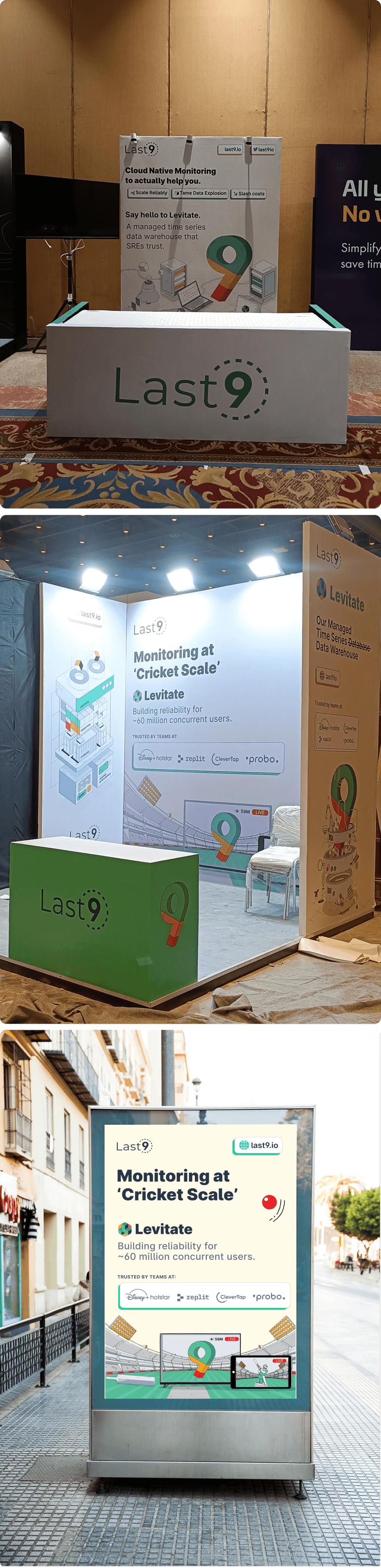
Be flexible enough to scale across product, marketing, content, merch, and events
02 BRANDING
Concept
The core idea was inspired by Rube Goldberg machines over engineered systems that use complex mechanisms to perform simple tasks. This became a visual metaphor for observability: many moving parts working together behind the scenes to make systems reliable and understandable.
This concept allowed us to visually represent complexity in a way that felt intentional, logical, and slightly playful—without trivializing the domain.
Colours
The palette was rooted in the actual product experience. I used a base of greys to reflect dashboards and technical environments, paired with Last9’s primary observability colours:
Green, Amber, Red used in a strict 4:2:1 ratio
These mirrored the alert states inside the product
Colour was used sparingly, acting as signal rather than decoration
Most technical illustrations appeared in muted blueprint-style greys and revealed colour only on interaction, reinforcing the idea that insight emerges through observability.
Typography
We used Inter as the primary typeface across brand and product. Reasons for this choice:
Highly legible for technical content
Neutral and familiar to engineers
Works well across UI, long-form writing, and marketing
Maintains consistency between product and brand touchpoints

Icons

Illustrations

04 USER INTERFACE
HOMEPAGE
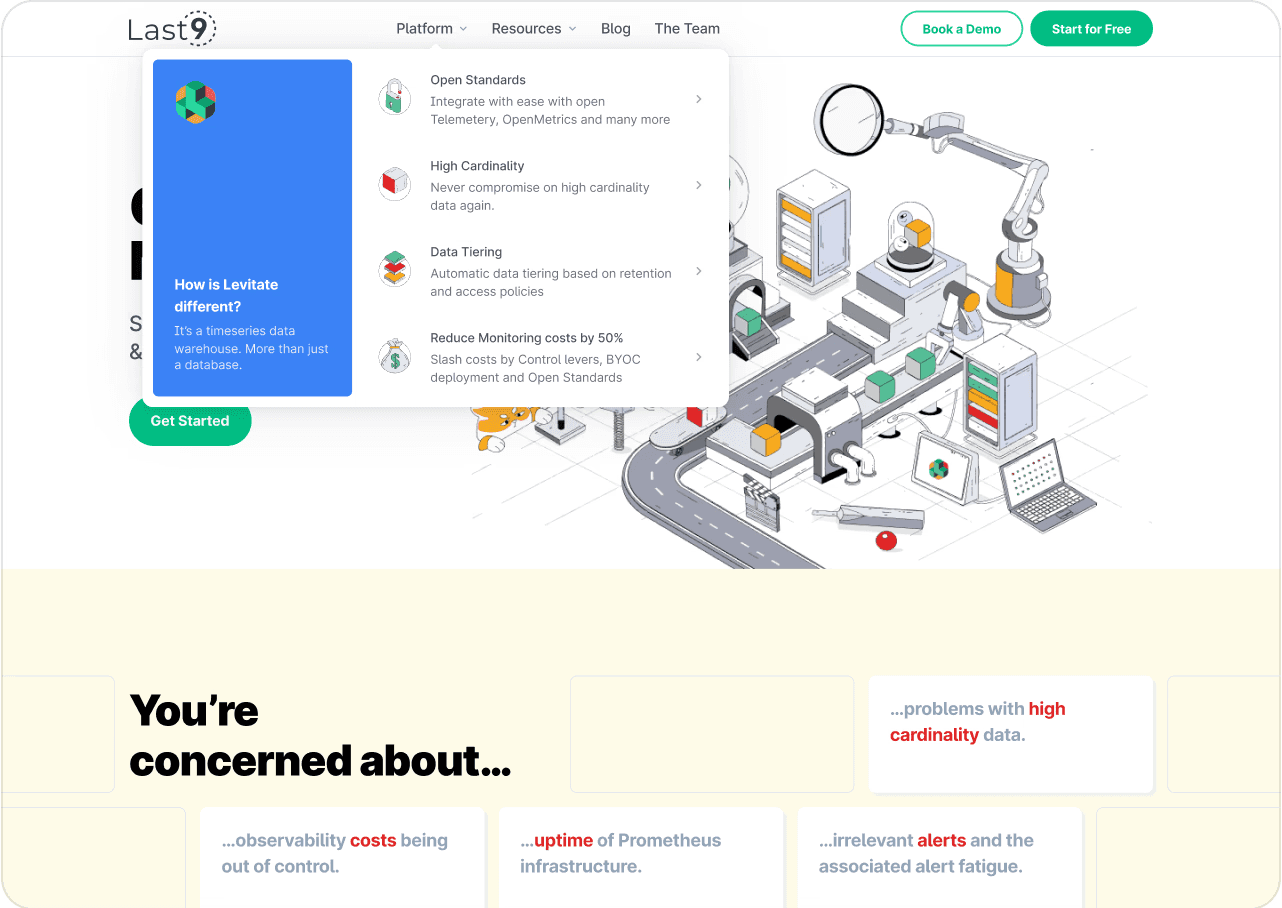
The marketing site UI was intentionally restrained, letting illustrations and content carry meaning.
Interactions were subtle hover reveals.
Blueprint-inspired visuals for technical credibility along with muted linework that revealed colour on hover or interaction

RESOURCES
The Resources section housed:
Technical blogs
Guides
Changelogs
Events and announcements
The cards in each section were designed carefully to create a visual distinction making content feel approachable and easier to digest.

OTHER PAGES
Special attention was given to often-overlooked surfaces:
Navigation menus that balanced clarity and exploration with unique icons
404 pages with contextual humor
Alert Studio screens tied closely to product concepts
Every page reinforced the larger system metaphor.

07 ADs
I designed both carousel and single-slot ads for performance and storytelling. These ads focused on:
Clear technical narratives
Strong visual metaphors
Minimal copy with concept-driven visuals
They were used across social, paid campaigns, and community channels.