
Lazy SRE
LazySRE.com is a weekly comic series by Last9 that turns the everyday struggles of Site Reliability Engineers into something light, funny, and relatable.

01 ABOUT
Role
UI Design
Brand Marketing Design
Framer Development
I created the full visual and interactive experience for LazySRE. This included:
Creating character designs
Illustrating every comic
Writing many of the comics (alongside the team)
Designing the UI and all interactive elements
Adding recurring callbacks like the “9” and a silent-reacting cat in each frame
My goal was to make the series feel warm, expressive, and instantly recognizable without forcing heavy branding.
TIMELINE
Aug 2024 - Jun 2025
Brief
Create a light, fun, highly-shareable web comic experience to help popularize Last9 among SREs and engineering teams.
02 Branding
Concept
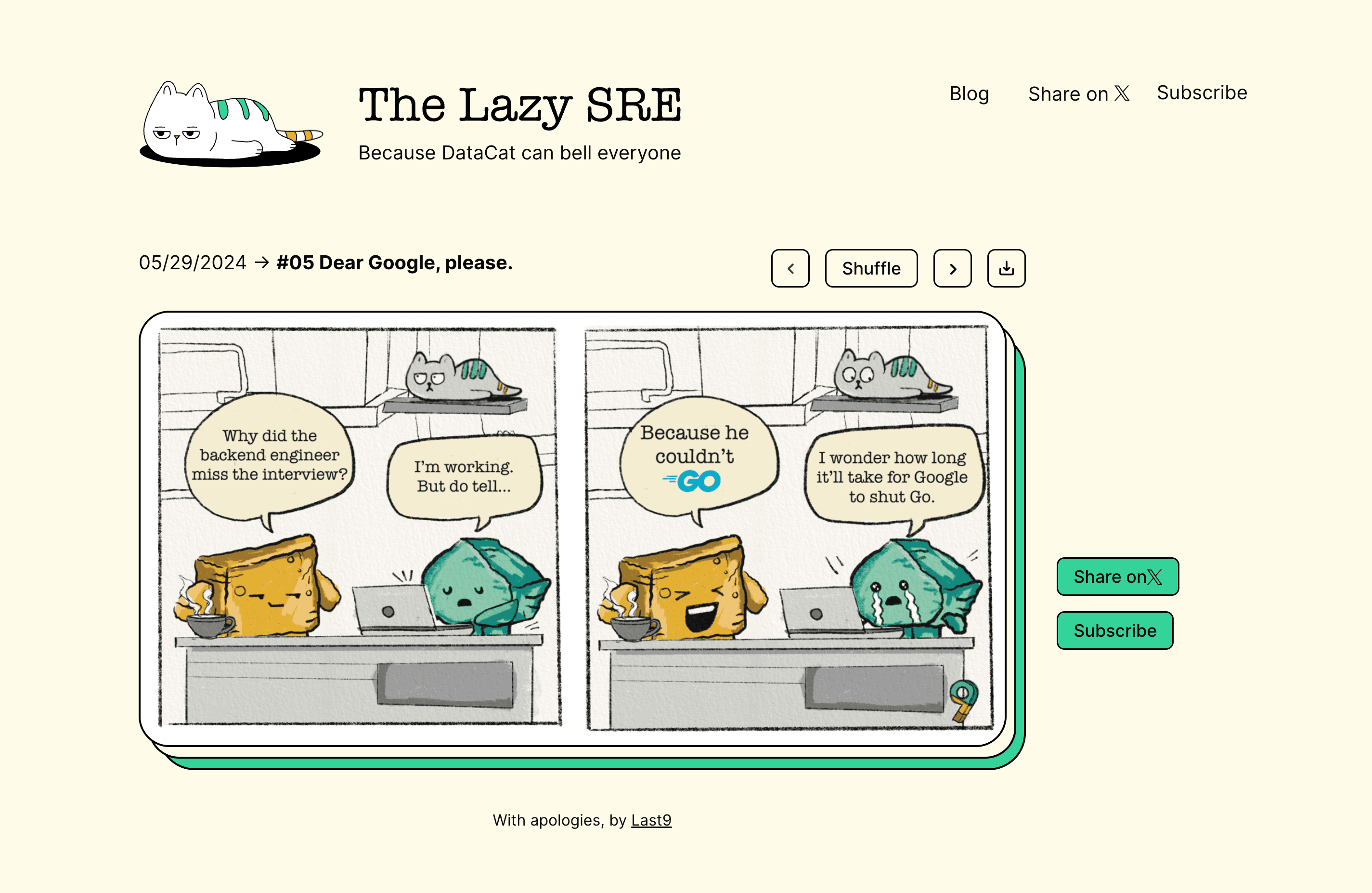
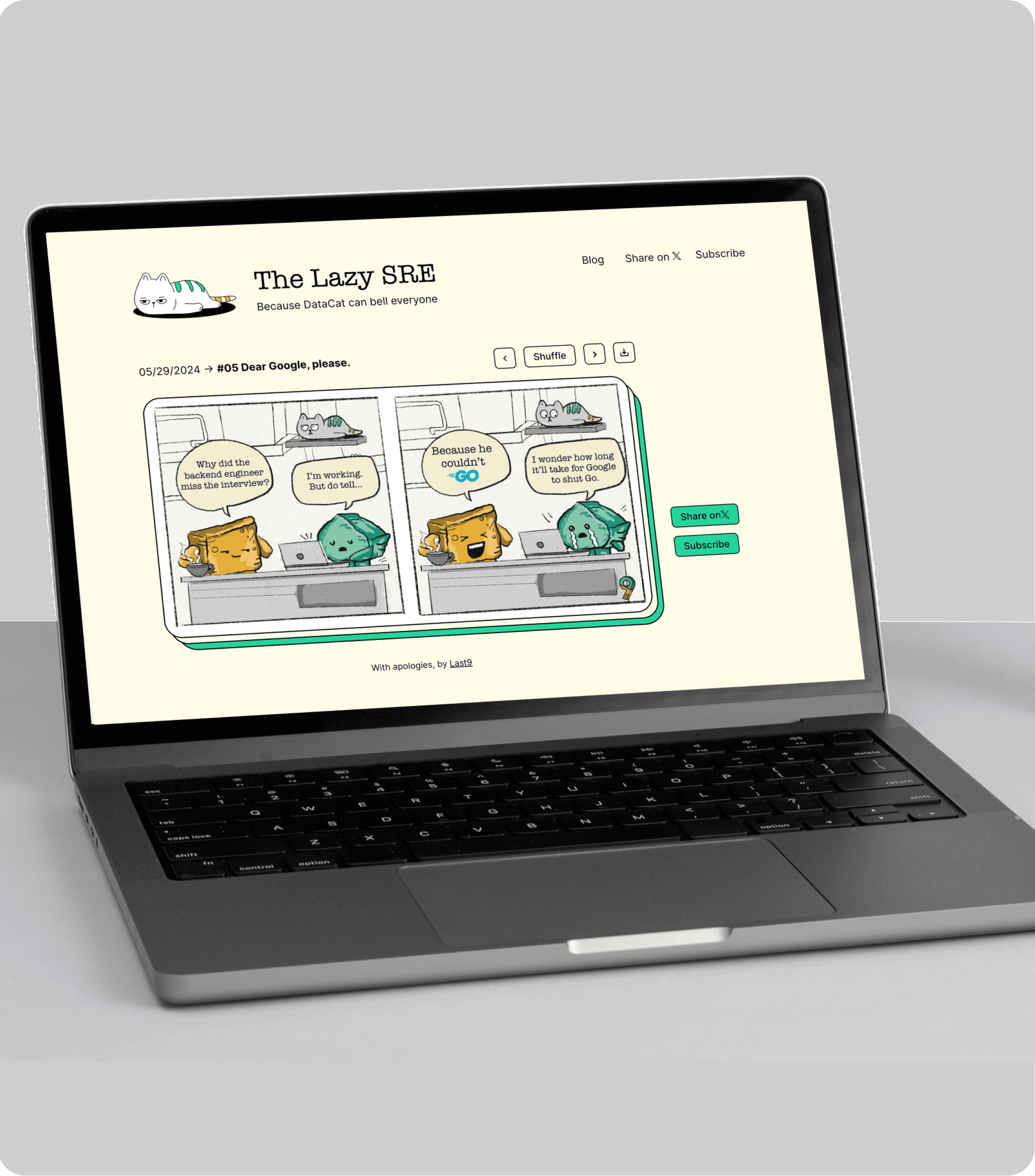
Build a web-friendly comic reader that people can
Read
Shuffle
Go next/previous
Download
Share on Twitter/X
Add hover-based captions with inside jokes or witty one-liners related to SRE culture.
Create an illustration style that feels approachable, nerdy, and fun, while still retaining the Last9 brand spirit.

User interface
The visual style intentionally stays close to Last9’s existing brand. I used the core Last9 color palette green, amber, and red along with the light yellow background, so the project felt clearly connected to the parent brand and not like a separate or throwaway experiment.

Character design
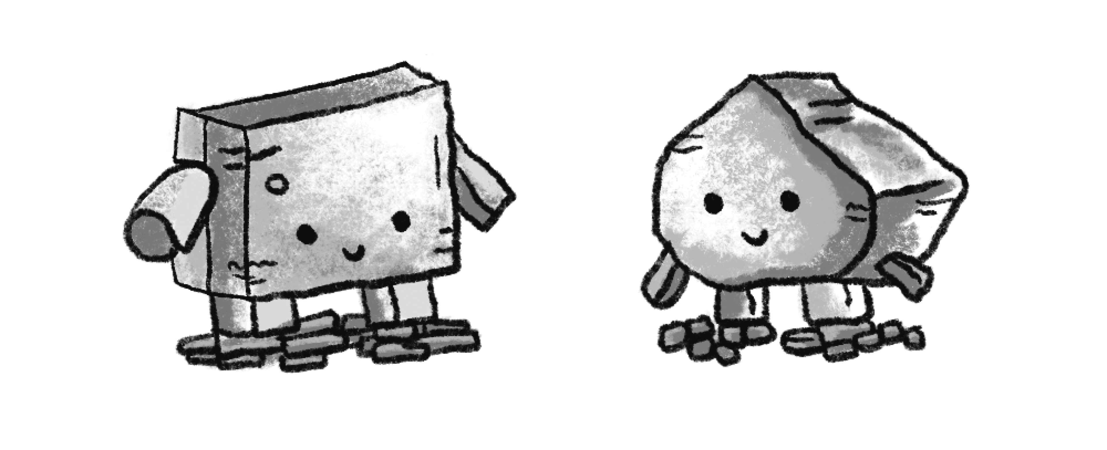
The main characters are designed as rocks, each with their own shape, color, and personality.
Why rocks? Rocks captured the spirit of SREs in a simple, symbolic way:
They’re strong and dependable, much like SREs holding up entire systems
They have a naturally calm, unbothered presence, even when everything is breaking
Their simplicity leaves room for exaggerated expressions, making them perfect for humor
Their grounded, slightly “lazy” vibe fits the theme of automating anything repetitive
They became a playful metaphor for reliability with personality.
03 Comics
To make the series feel cohesive and fun, I added:
A subtle “9” in every strip as a Last9 signature
A cat that appears in every frame as a silent observer reacting to the story
A consistent visual language across colors, shapes, and scenes
To balance the brand structure with warmth and humor, I paired the brand colors with a hand-drawn illustration style. The rough lines and imperfect shapes helped the characters and scenes feel expressive and human, to match the tone of the comics.


05 LEARNINGS
How illustration style can shift the perceived personality of a writing tool
How color choices strongly influence whether a brand feels enterprise or creative
The importance of consistency across illustration, icons, and color
How subtle textures can make digital products feel more human
That playful elements can still be clean and professional when balanced well
Have a nice day :)
© 2026 All Rights reserved
Lazy SRE
LazySRE.com is a weekly comic series by Last9 that turns the everyday struggles of Site Reliability Engineers into something light, funny, and relatable.
01 ABOUT
Role
UI Design
Brand Marketing Design
Framer Development
I created the full visual and interactive experience for LazySRE. This included:
Creating character designs
Illustrating every comic
Writing many of the comics (alongside the team)
Designing the UI and all interactive elements
Adding recurring callbacks like the “9” and a silent-reacting cat in each frame
My goal was to make the series feel warm, expressive, and instantly recognizable without forcing heavy branding.
TIMELINE
Aug 2024 - Jun 2025
Brief
The brief was to develop a brand identity that captures the joy of writing without feeling too corporate or boring. The website needed to feel:
Creative
Friendly
Light and expressive
Still polished enough for professionals who use the tool
The challenge was finding a style that balances creativity and credibility.to scale across product, marketing, content, merch, and events
02 Branding
Concept
Build a web-friendly comic reader that people can
Read
Shuffle
Go next/previous
Download
Share on Twitter/X
Add hover-based captions with inside jokes or witty one-liners related to SRE culture.
Create an illustration style that feels approachable, nerdy, and fun, while still retaining the Last9 brand spirit.
User interface
The visual style intentionally stays close to Last9’s existing brand. I used the core Last9 color palette green, amber, and red along with the light yellow background, so the project felt clearly connected to the parent brand and not like a separate or throwaway experiment.
Character design
The main characters are designed as rocks, each with their own shape, color, and personality.
Why rocks?
Rocks captured the spirit of SREs in a simple, symbolic way:
They’re strong and dependable, much like SREs holding up entire systems
They have a naturally calm, unbothered presence, even when everything is breaking
Their simplicity leaves room for exaggerated expressions, making them perfect for humor
Their grounded, slightly “lazy” vibe fits the theme of automating anything repetitive
They became a playful metaphor for reliability with personality.
03 Comics
To make the series feel cohesive and fun, I added:
A subtle “9” in every strip as a Last9 signature
A cat that appears in every frame as a silent observer reacting to the story
A consistent visual language across colors, shapes, and scenes
To balance the brand structure with warmth and humor, I paired the brand colors with a hand-drawn illustration style. The rough lines and imperfect shapes helped the characters and scenes feel expressive and human, to match the tone of the comics.

06 LEARNINGS
How illustration style can shift the perceived personality of a writing tool
How color choices strongly influence whether a brand feels enterprise or creative
The importance of consistency across illustration, icons, and color
How subtle textures can make digital products feel more human
That playful elements can still be clean and professional when balanced well
04 Socials
I designed the emailer templates, subscribe experience, and social sharing assets used to publish a new comic every week.
Each touchpoint followed the same visual language as the site, so the comics felt instantly recognizable whether they showed up in an inbox or on social media. The goal was simple: make it easy for people to discover a comic, smile, and share it with their team or their timeline.


Have a nice day :)
© 2026 All Rights reserved
Lazy SRE
LazySRE.com is a weekly comic series by Last9 that turns the everyday struggles of Site Reliability Engineers into something light, funny, and relatable.
01 ABOUT
Role
UI Design
Brand Marketing Design
Framer Development
As the Brand Designer + Illustrator, I shaped the visual direction of Thinkdeli’s web presence. My responsibilities included:
Defining the color palette
Proposing and evolving the illustration style
Creating the hero/landing page illustration
Designing the footer artwork
Building a cohesive icon set that brings personality into the UI
I ensured the brand felt playful, inviting, and creative—reflecting the experience of writing and ideation.
TIMELINE
Aug 2024 - Jun 2025
Brief
The brief was to develop a brand identity that captures the joy of writing without feeling too corporate or boring. The website needed to feel:
Creative
Friendly
Light and expressive
Still polished enough for professionals who use the tool
The challenge was finding a style that balances creativity and credibility. to scale across product, marketing, content, merch, and events
02 Branding
Concept
Build a web-friendly comic reader that people can
Read
Shuffle
Go next/previous
Download
Share on Twitter/X
Add hover-based captions with inside jokes or witty one-liners related to SRE culture.
Create an illustration style that feels approachable, nerdy, and fun, while still retaining the Last9 brand spirit.
User interface
The visual style intentionally stays close to Last9’s existing brand. I used the core Last9 color palette green, amber, and red along with the light yellow background, so the project felt clearly connected to the parent brand and not like a separate or throwaway experiment.
Character design
The main characters are designed as rocks, each with their own shape, color, and personality.
Why rocks?
Rocks captured the spirit of SREs in a simple, symbolic way:
They’re strong and dependable, much like SREs holding up entire systems
They have a naturally calm, unbothered presence, even when everything is breaking
Their simplicity leaves room for exaggerated expressions, making them perfect for humor
Their grounded, slightly “lazy” vibe fits the theme of automating anything repetitive
They became a playful metaphor for reliability with personality.
03 Comics
To make the series feel cohesive and fun, I added:
A subtle “9” in every strip as a Last9 signature
A cat that appears in every frame as a silent observer reacting to the story
A consistent visual language across colors, shapes, and scenes
To balance the brand structure with warmth and humor, I paired the brand colors with a hand-drawn illustration style. The rough lines and imperfect shapes helped the characters and scenes feel expressive and human, to match the tone of the comics.
04 Socials
I designed the emailer templates, subscribe experience, and social sharing assets used to publish a new comic every week.
Each touchpoint followed the same visual language as the site, so the comics felt instantly recognizable whether they showed up in an inbox or on social media. The goal was simple: make it easy for people to discover a comic, smile, and share it with their team or their timeline.
05 LEARNINGS
How illustration style can shift the perceived personality of a writing tool
How color choices strongly influence whether a brand feels enterprise or creative
The importance of consistency across illustration, icons, and color
How subtle textures can make digital products feel more human
That playful elements can still be clean and professional when balanced well
Have a nice day :)
© 2026 All Rights reserved
04 Socials
I designed the emailer templates, subscribe experience, and social sharing assets used to publish a new comic every week.
Each touchpoint followed the same visual language as the site, so the comics felt instantly recognizable whether they showed up in an inbox or on social media. The goal was simple: make it easy for people to discover a comic, smile, and share it with their team or their timeline.